Google+ Re-design and WhiteSpace Rant!
0 up · 0 down · 0 ratings
Channels and socials
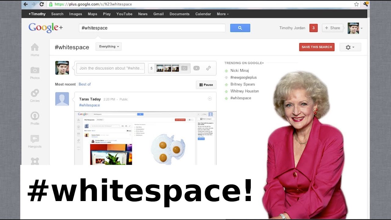
My redesigned profile: gplus.to The new Google+ UI looks beautiful and slick. Yet the white space on the side of Google+ has gotten almost as much attention as the redesign itself! Here are the best uses of the infamous #whitespace Post-it Notes: goo.gl Going Green: goo.gl Brace yourself: goo.gl Mr. Paper clip: goo.gl Vanna Whitespace: goo.gl Betty Whitespace: goo.gl A Google+ in your Google+: goo.gl Google's Official Video: youtu.be Top Google+ Tips and Tricks: youtu.be ~ twitter.com gplus.to @MarquesBrownlee @MKBHD
The video introduces Marques Brownlee’s take on Google+ shortly after Google rolled out a major UI refresh. He highlights the shift to a columnar layout with a clean, streamlined look, pointing out the left-hand navigation and a central timeline that aggregates posts from people you follow. He also notes a distinctive feature for social interaction: a bottom chat module that resembles a Facebook-style chat panel, which could prove useful for frequent users. A standout talking point is the large white space in the middle of the screen, which viewers quickly associated with a playful range of possible uses, from sticky notes to mini apps like a small text editor or even a playful nod to classic interfaces like Vanna White and Microsoft Office’s Clippy. Marques demonstrates his personal approach by discussing how he customized his Google+ profile cover photo and invites viewers to explore the whitespace concepts in his provided links. Throughout, he maintains an upbeat tone, appreciating the redesign while inviting discussion on practical uses and potential trade-offs. The video blends tech critique with humor, using real-world examples to explore how UI changes can impact daily usage and layout aesthetics, and ends with a teaser about future content and a call to action for viewers to share their own whitespace ideas in the comments.
Topics · technology · social media · ui ux · reviews